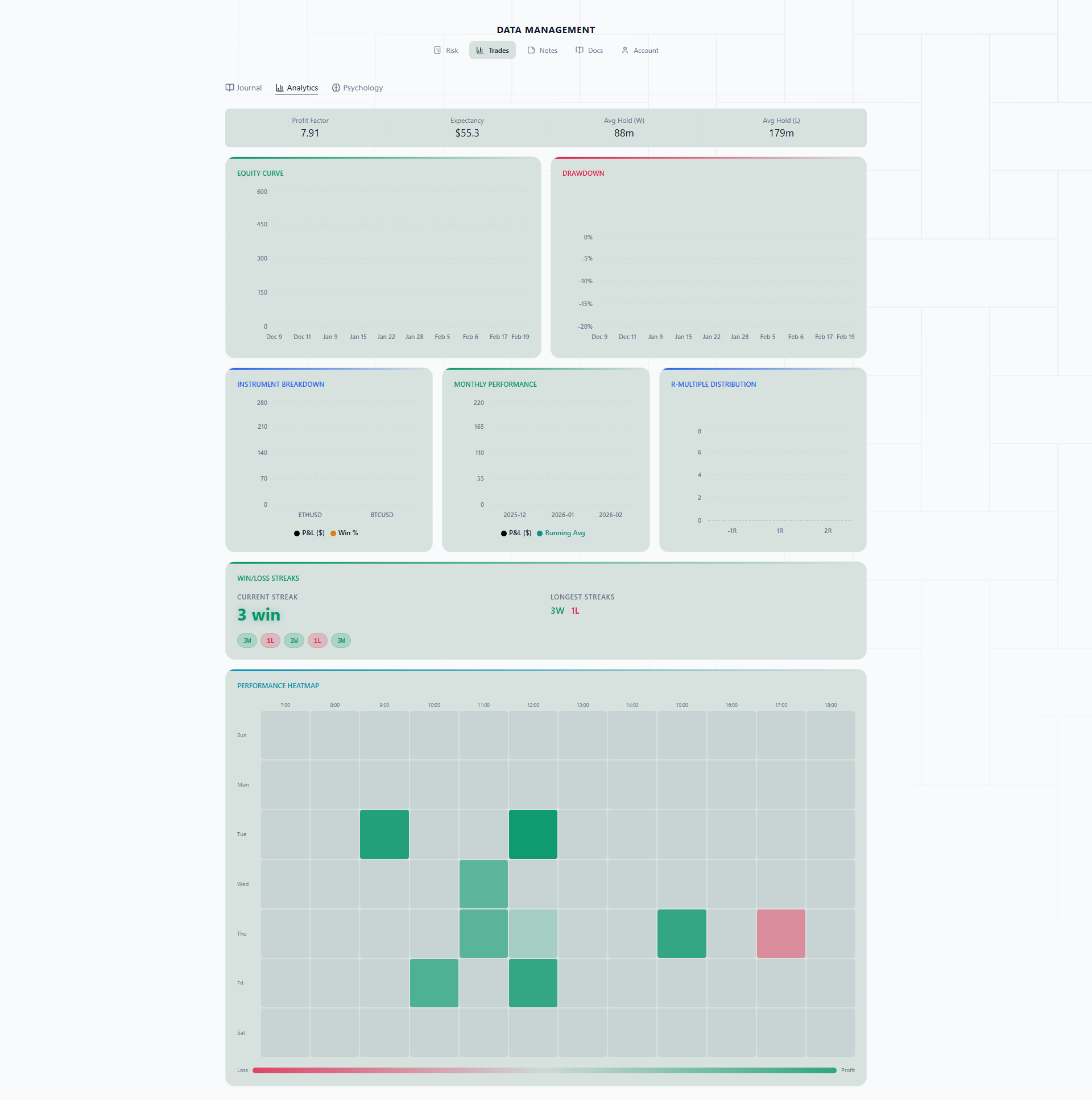
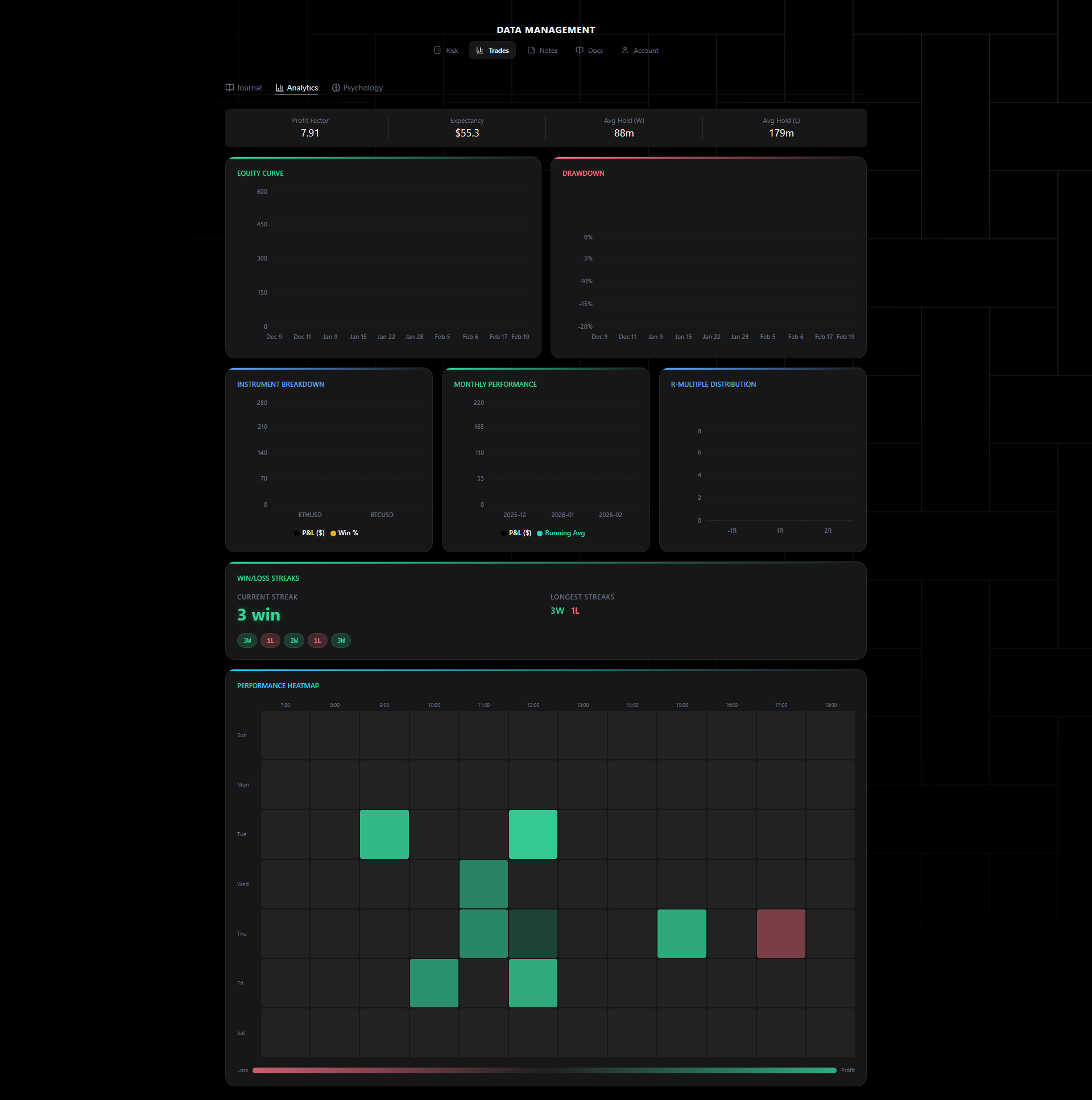
Analytics
The Analytics tab provides visual performance analysis of your trading journal. Available on Starter and PRO plans.
Data Over Gut Feelings
Here is something most traders get wrong: they think they know how they are performing. Study after study shows that traders consistently overestimate their win rate, underestimate how long their drawdowns last, and misremember which instruments actually make them money.
This is not a character flaw. It is how human memory works. You remember the big XAUUSD win from last Tuesday but forget the three small GBPUSD losses that preceded it. You remember the “great week” but blur together the mediocre two weeks before it.
Analytics replace selective memory with objective data. When you see a flat equity curve during a period you thought was profitable, that is not the chart being wrong — it is your memory being human. The numbers do not have an ego, and that is exactly why they are useful.
The goal is not to feel bad about your performance. It is to make decisions based on what actually happened rather than what you think happened.
Equity Curve
A line chart tracking your cumulative P&L over time. Shows overall account trajectory and helps identify growth phases and drawdown periods.
What to look for: A healthy equity curve trends upward with manageable dips. If you see a long flat section, that tells you something — maybe you switched strategies, reduced size, or went through a rough patch. If the curve drops sharply and stays down for weeks, that is a signal to review what changed.
Real-life scenario: You look at your equity curve for February and notice it was climbing steadily for the first two weeks, then went completely flat. You check your journal and realize that is exactly when you switched from your swing trading approach to scalping NAS100. The curve is telling you the strategy change did not help — it stalled your progress.
Drawdown Chart
Visualizes drawdown depth and duration from equity peaks. Helps you understand your worst losing periods and recovery patterns.
What to look for: Pay attention to both depth (how much you lost) and duration (how long it took to recover). A 5% drawdown that recovers in 3 days is very different from a 5% drawdown that takes 3 weeks to climb back from. Also look for patterns in timing — do your drawdowns cluster around specific days, events, or periods?
Real-life scenario: Your drawdown chart shows three significant dips over the past quarter. You notice something interesting: all three came right after a winning streak of 5+ trades. The pattern is clear — after a hot streak, you get overconfident, size up too aggressively, and give back your gains. That is not bad luck. It is a behavioral pattern, and now you can address it.
Instrument Breakdown
Bar chart showing P&L by instrument. Quickly see which instruments are profitable and which are dragging performance.
What to look for: Most traders are surprised by how concentrated their profits are. It is common to find that 70-80% of your total P&L comes from just one or two instruments, while several others break even or lose money. That is useful information, because it raises a question: why are you still trading the unprofitable ones?
Real-life scenario: You trade five instruments regularly: EURUSD, GBPUSD, XAUUSD, NAS100, and BTCUSD. The breakdown shows XAUUSD and NAS100 account for +$3,200, EURUSD is flat at +$80, GBPUSD is -$450, and BTCUSD is -$620. You are spending time and mental energy on GBPUSD and BTCUSD for a net loss. Dropping them (or at least reducing size) would improve your results immediately — without learning anything new.
R-Multiple Distribution
Histogram of trade outcomes measured in R-multiples (risk units). Shows how your wins and losses distribute relative to your risk.
What to look for: A right-skewed distribution is ideal — most losses clustered around -1R with a tail of winners extending to 2R, 3R, or beyond. If your winners cluster tightly around 1R to 1.5R, you might be cutting profits too early. If you see losses beyond -1R, your stop-loss discipline needs attention because those are trades where you moved your stop or did not have one.
Real-life scenario: Your histogram shows a neat cluster of losses at -1R (good discipline) but your winners peak at 1.2R and almost nothing reaches 2R. You set 2R targets but consistently close at 1.2R because of fear. The chart makes this habit visible. Even a small improvement — holding to 1.5R average instead of 1.2R — compounds into significantly better results over 100+ trades.
Streaks
Track consecutive winning and losing streaks:
- Current streak
- Best winning streak
- Worst losing streak
- Average streak length
How to read this: Streaks are normal. Even a 60% win rate system will produce 4-5 trade losing streaks regularly. Knowing your historical worst losing streak helps you stay calm during drawdowns — if your worst ever was 7 losses in a row and you are currently at 4, you know this is within your normal range. If you are exceeding your historical worst, that is a signal to pause and reassess.
Performance Metrics
- Profit Factor — Gross profit / Gross loss. Anything above 1.0 means you are net profitable. Above 1.5 is solid. Above 2.0 is excellent. Below 1.0 means you are losing money overall.
- Expectancy — Average R-multiple per trade. This tells you how much you expect to make per unit of risk on each trade. Positive expectancy is the baseline requirement for a viable strategy.
- Win Rate — Percentage of winning trades. Context matters here. A 40% win rate with 3R average winners is far better than a 70% win rate with 0.5R average winners.
- Average Winner — Mean P&L on winning trades.
- Average Loser — Mean P&L on losing trades. The ratio between Average Winner and Average Loser is arguably more important than win rate.
- Best Trade — Largest single win.
- Worst Trade — Largest single loss. If this number is several times larger than your Average Loser, it means you had a blowup — a trade where risk management failed.
- Average RR — Mean risk-reward ratio.
How to Read Your Analytics
Weekly check-in (5 minutes). Glance at your equity curve and performance metrics. Is the curve trending in the right direction? Is your profit factor above 1.0? This is a quick sanity check, not deep analysis.
Monthly deep dive (30 minutes). At the end of each month, go through every chart:
- Equity curve — Identify the good stretches and the bad ones. Cross-reference with your journal to understand what caused each.
- Drawdown chart — Note the worst drawdown of the month. How long did it take to recover? Was there a behavioral trigger?
- Instrument breakdown — Are your profitable instruments still the same ones? Should you drop any underperformers?
- R-multiple distribution — Are you holding winners long enough? Are your losses staying at -1R?
- Streaks — Did you have any unusually long losing streaks? How did you handle them emotionally?
- Performance metrics — Compare to last month. Look for trends, not single data points.
Warning signs to watch for:
- Profit factor dropping below 1.2 for two or more consecutive weeks
- Drawdown duration increasing even if depth stays the same (you are recovering more slowly)
- Average loser growing while average winner stays flat (your risk management is slipping)
- Win rate changing dramatically in either direction (something shifted in your approach or the market)
The point of all this is not to obsess over numbers. It is to catch problems early, before they compound into account damage, and to double down on what is actually working.