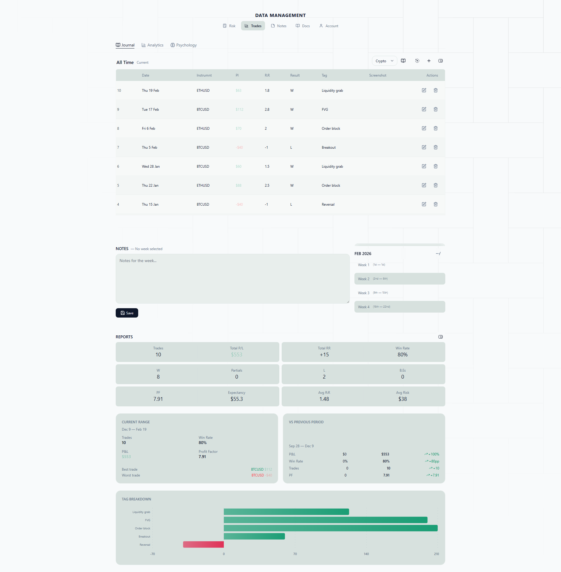
Calendar View
The calendar view displays your trades in a month grid with color-coded heatmap cells. Each day shows trade indicators and aggregate P&L.
Why a Calendar View?
Spreadsheets give you rows of numbers. Numbers are precise, but they are terrible at showing you patterns over time. You can stare at a column of daily P&L figures and completely miss the fact that three out of four Mondays were red, or that your best weeks always follow a losing streak.
A calendar heatmap solves this by turning your trade data into something your brain processes instantly — color. You open the calendar and within two seconds you can see: “This month was mostly green in the first two weeks, then fell apart after the 15th.” That kind of insight takes minutes to extract from a table and zero effort from a heatmap.
This is the view you will probably use most often. It is where your weekly reviews start, and it is the fastest way to get a read on how your trading month is going.
Real-Life Scenarios
Spotting day-of-week patterns. You trade XAUUSD during the London session. After a month of journaling, you pull up the calendar and notice something: almost every Monday cell is red or neutral, while Tuesdays and Wednesdays are consistently green. You dig into the data and realize that gold tends to range on Mondays as the market establishes the week’s direction, and your breakout strategy does not work well in ranges. You adjust by sitting out Mondays or switching to a mean-reversion approach. The next month, your Monday cells turn neutral — and your overall win rate goes up.
Catching overtrading weeks. You have had a rough week trading EURUSD and NAS100. You took 23 trades in five days. The calendar makes this obvious — one particular Wednesday has six trade pills stacked in its cell, and the day is a deep red. You count the pills across the week and see the density is way higher than your typical weeks (which average 8-10 trades). The correlation is clear: more trades, worse results. You set a personal rule to cap yourself at 3 trades per day.
Monthly review at a glance. It is the last day of the month. You open the calendar to do your monthly review. The first half of the month is a sea of green — you were following your plan, taking clean setups on GBPUSD. Then around the 18th, the colors shift to red. You click into those days and realize you switched to trading BTCUSD after seeing it trending on social media, took oversized positions, and gave back most of your monthly gains. The visual contrast between the two halves of the month tells the story more powerfully than any equity curve could.
Heatmap
Day cells are shaded by net P&L:
- Green shades — Net profitable days (darker = more profit)
- Red shades — Net losing days (darker = more loss)
- Neutral — No trades or break-even
The heatmap gives an instant visual read of your monthly performance pattern. The intensity of the color is proportional to the size of the win or loss, so you can immediately spot your biggest days — both good and bad.
Trade Pills
Each trade appears as a small pill on its close date:
- Green pill — Winning trade
- Red pill — Losing trade
- Gray pill — Break-even
Click any pill to open the full trade detail panel. This means you can go from “I see a big red day” to “here is exactly what happened on that trade” in a single click.
Day Cells
Each day cell shows:
- Trade count for the day
- Net P&L in dollars
- Individual trade pills
Days with more trades show more pills, giving a visual density indicator. If you see a day with six pills and a red total, you know overtrading was likely the issue before you even click into it.
Month Navigation
- Navigate forward/backward by month
- Quick jump to current month
- Month-level summary stats shown above the grid (total trades, win rate, net P&L)
The month-level summary gives you the headline numbers — how many trades you took, your win rate, and your net result — so you can compare months without switching to the analytics view.
Weekly Notes
Each week row has a notes indicator. Click to open a rich-text note attached to that trading week. Use weekly notes for reflections, market observations, or strategy adjustments.
How to Use Weekly Notes Effectively
Weekly notes are most valuable when you write them consistently and with a simple structure. Here is a practical workflow:
1. Set a review time. Pick a specific time — Sunday evening or Monday morning before the market opens. Block 15-20 minutes. This is your weekly review slot.
2. Look at the week’s heatmap. Before you write anything, just look at the calendar row for the past week. Note the colors, the density of pills, and the daily P&L totals. What jumps out?
3. Write down three things. Keep it structured:
- What worked this week — Which setups played out? Which days were cleanly executed? (e.g., “Tuesday’s EURUSD break-and-retest was textbook. Waited for confirmation, entered on the pullback, hit 2R.”)
- What did not work — Where did you deviate from your plan? What trades should you not have taken? (e.g., “Thursday’s NAS100 trade was pure FOMO. Entered at resistance with no pullback, got stopped out in 20 minutes.”)
- One adjustment for next week — Based on what you observed, what is one specific thing you will do differently? (e.g., “No trades in the first 30 minutes of New York session — I keep getting caught in the opening volatility.”)
4. Tag market context. Note any macro events or market conditions that affected your trading — NFP week, FOMC, low liquidity holiday period, trending vs. ranging markets. This context is invaluable when you review multiple weeks later and try to understand why certain periods performed differently.
5. Review previous week’s adjustment. Before finishing, scroll back to last week’s note and check: did you actually follow through on the adjustment you committed to? This accountability loop is where the real improvement happens.
The goal is not to write an essay. Three to five sentences covering what worked, what did not, and what you are changing is enough. Consistency matters far more than length.